If you have done everything within your power to optimise your landing pages for conversions (if you haven’t then be sure to check out these 25 useful conversion optimisation tips!).
Well, guess what? Chances are, so have your competitors. But even with the upshift in websites caring about their conversion rates, the global average conversion rates seem to have been stuck between 2 to 5 percent forever.
This means at least 95% of your visitors are not buying from you, no matter how much you optimise your website. But why?
The Secret of High Conversion Rates
One of the secrets to high conversion rates is understanding that the elements on your website aren’t the most important factor. The most important factor is inside the mind of your website visitors.
If your webpages can unlock that secret by interacting with your visitors, there’s no reason why you shouldn’t be able to double or triple your conversions. You will probably never get to anywhere close to a 25% conversion rate, simply because not everybody who comes to your website is looking to buy your product or service.
In other words, they don’t have the intent to buy, at least for now. And this is the key mindset to remember in all forms of digital marketing – INTENT.
The Classic Conversion Funnel Model
According to the classic theory of consumer buying behaviour, people go through at least five different stages before they become a regular customer.
The classic model of consumer buying behaviour, shown below, comprises of awareness, interest (or familiarity), information search (or consideration), purchase, and post-purchase (or loyalty) stages.

For those who are not familiar with this model, the different stages of the buying cycle can be understood as follows:
- Awareness: The consumer becomes aware of his/her needs and starts looking for solutions
- Familiarity: The consumer becomes familiar with the available solutions (products or brands) by gathering information about them
- Consideration: The consumer compares different alternatives to decide which particular solution is going to work for them
- Purchase: They make the decision to buy from a particular business or brand
- Loyalty: They evaluate their purchase and decide whether to keep buying from the brand
Matching the Message with the Stage in Buying Funnel
As you can see, this model assumes a consumer’s buying behaviour to be a linear process.
As consumers transition from one stage to the next, they narrow down their choices and finally stick with a single product, business or brand. For achieving the most conversions, marketers must reach consumers at specific moments that most influence their buying decisions. They must deliver the right message at the right stage of the buying or conversion funnel.
For example, on-page conversion optimisation factors like big ‘buy’ buttons, clear layouts, and smooth navigation will not convert a visitor who is just beginning to realise he/she has an unfulfilled need and is only looking for information about available solutions or perhaps reviews of a product.
At this stage, marketers should instead try and feature their brand as an alternative to consider, or their store as a trustworthy reseller. On the other hand, a visitor who is ready to buy should not be distracted by unnecessary information, as he/she has already progressed through the familiarity (information search) and consideration stages, and the most important thing for them is a smooth purchasing experience.
Conversion Optimization Roadblocks
There are two problems that make it difficult to practice this approach of matching the message with the stage in the buying funnel.
Conversion Roadblock #1
Marketers don’t know for sure which stage of the buying funnel the visitor is at, and what is the appropriate type of message, or action trigger, for that particular stage.
In the absence of a viable model for finding out the stage in the buying funnel and matching the message with that stage, marketers mainly have their instincts to rely on. They can test different variations of the landing page by changing different elements, such as the CTA copy, product benefits, colours, and layout.
However, much of the testing may be wasteful, as it would not be based on any scientific model. A/B testing is key here!
Conversion Roadblock #2
The proliferation of media and available choices has empowered the consumer to an extent that the classic model of consumer buying behaviour is not as valid anymore.
Consumers have unlimited channels available to them, for identifying the alternative solutions to their problem, gathering information, and comparing those alternatives before reaching the decision to buy. Consumers are no longer passive, waiting for the marketers to reach out to them.
Instead, the interaction between businesses and their customers has become two-way. Consumers have become empowered and do not follow the classic buying model anymore.
Let’s look at each of these problems more closely.
Discovering Customer Intent
A logical conclusion of the buying funnel model is that a single type of message will not work for every visitor.
Instead of planning for conversions in a vacuum, marketers have to find out where, precisely, in the buying funnel there seems to be a problem. The easiest way to isolate the problem is through your Google Analytics.
Hence, if you see that most of your visitors are abandoning your page soon after landing on it, it’s the initial stages of the funnel that you need to address. And if people are not completing the purchase after they have clicked the buy, subscribe or download button, the problem exists in the final stages of the funnel.
Google Analytics tells you the page where most of the dropouts are taking place. But it doesn’t tell you why people are leaving the page and exactly what you need to change on the page.
Many marketers rely on their gut feeling to find out the exact point of the problem and apply fixes, which can sometimes work. But a much better way is through testing.
Tools like heat-mapping or mouse-tracking can help you zero-in on the source of the problem and solve it quickly and cost-effectively. They can tell you precisely which part of your page most of your visitors look at before they leave your site.
Let’s say you’re using conversion testing tools and know the point in the conversion funnel that’s causing the bleed. This allows you to pinpoint the probable stage where those visitors are, but you’ve only actually solved just one side of the equation.
You still don’t know what type of message you need to deliver at that point in order to make visitors stay on your site and progress to the next stage in the funnel. Perhaps, you could do better if you knew the critical elements of online behaviour—what kind of experience people are looking for at different points in the funnel.
The Elements of Web Experience
A peer-reviewed study published in the International Journal of Business and Management analysed academic papers on CRO published from 2004 to 2012. It concluded that the classic conversion model funnel was missing one crucial element—experience.
Interestingly, a McKinsey study examining the purchase decisions of almost 20,000 consumers also reaffirms that online behaviour is radically different from an offline or real-world experience.
For example, leaving a website and going to another one is as simple as clicking the back button, and then clicking another search result. Leaving a physical store without buying anything means having to drive to another store, something that most people won’t be willing to do. The internet is different from the real world – it’s virtual, and a web experience is different from a real-world experience.
This is very important to remember, it builds on the earlier assertion that INTENT is the key mindset.
The researchers from the first study held an in-depth interview with the founder of the US-based conversion optimisation agency Clixo, which has worked with companies like Nissan, Samsung, Motorola, Hyundai, and Peugeot. They found out that Clixo uses a proprietary conversion optimisation model called Clixo’s Conversion Framework™. The model was developed over a period of 9 years, through research and extensive real-world work that Clixo carried out for its paying clients.
Clixo’s Conversion Framework™
The Clixo’s Framework identifies five components of web experience that are crucial for converting a website visitor into a customer.
1. Catalyst: What is the motivation and traffic source? Clixo tries hard to understand what triggered a visit and the traffic source. This information helps them understand better the visitors who are serious about purchasing the company’s products or services and the stage of buying funnel they’re in, in order to determine how to best start the conversation.
2. Value: Value is based on the visitor’s perception of a company’s website and products. That’s why it’s imperative to gather customer feedback or behavioural insights with tools like Quaraloo. To your website visitors, value means being unique, relevant, and specific.
a. Unique: Does the visitor feel the conversation on your website or landing page is unique and distinct from other sites?
b. Relevant: Is the message or conversation relevant to your visitor’s intent?
c. Specific: Does it directly and precisely address your visitor’s concerns?
TOP TIP: Using creative and persuasive copywriting is very important for creating value.
3. Usability: Is your site user-friendly? Is the interface intuitive and simple? Does it load quickly? There are tons of studies proving the importance of usability for a good user experience. Avoiding frustrating navigation menu’s, popups, and cluttered layouts improve usability. Bold headlines, clear fonts, impressive copywriting, formatting, and dark coloured text on a white background are just some of the elements of a user-friendly website design.
4. Persuasion: Persuasion depends on clarity and incentive. Clarity means that the value proposition is communicated clearly through copy, pictures, video, and design on both service sections and product page copy. The incentive is how the company incentivises a purchase, e.g. “buy before such and such time and win a free gift.” Persuasive copywriting need not be very creative, but brief, bold and compelling.
5. Confidence: Confidence is about reducing anxiety and inducing trust. Blogs like CrazyEgg, Unbounce, QuickSprout and others have tons of articles on it. Using trust symbols such as VeriSign Secured, guarantee seal, or a padlock icon reduces anxiety and can boost buyer confidence.
Customer testimonials, social proof, and reviews boost trust too, whereas free trials generally increase anxiety if they are accompanied by lots of small print.
If you aren’t already, you should be building your social audience using tools like Marketing Labs Scheduler, and monitoring brand activity and mentions using something like Cyfe. Doing social media correctly can help make big strides into building confidence.
These five web behaviour factors greatly influence conversions and must be addressed for building high-converting websites. Clixo has successfully used this Framework to double the conversion rates for most of its clients. In addition to these, the study uncovers two more behaviour elements. These are:
6. Aesthetics: The optics or the visual appearance of the website. Because conversions depend on the perception and intent of your customer, there’s no hard and fast rule for creating great aesthetics. We have Google, on one hand, doing great with a minimalist interface, and Craigslist on the other hand, with a cluttered but useful design that has held its own for over two decades.
7. Interactivity: The internet has the capability to provide highly interactive and personalised experiences. The responsiveness of the company to the individual needs of the customer has a strong bearing on conversions. Contemporary web users are savvy and like to solve their problems themselves, using interactive tools, FAQs, forums, blogs, videos, and if need be, live chat. A high converting website provides these interactive features.
The Linear CRO Model
Founder of Growfusely, Pratik Dholakiya has proposed a comprehensive model of conversion optimisation by superimposing the above seven behavioural elements with the five stages of the conversion funnel. Here’s the model that emerges, as published in his post on Unbounce.
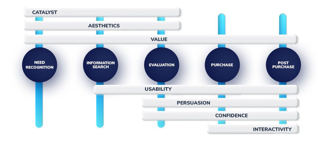
According to Dholakiya’s model, each element of web behaviour corresponds to specific stages in the buying funnel. For instance, Catalyst and Aesthetics are relevant in the initial three steps, when the consumer is becoming aware, gathering information and evaluating options. Persuasion and Confidence work best towards the end of the funnel, and Value is important throughout all the stages.
The above model clarifies some of the confusion about the specific actions you should take to address conversion issues occurring at different stages.
It gives marketers a framework to form and test different hypotheses instead of relying on guesswork and wasting time and money on unnecessary tests. However, there’s just one problem that makes this model dysfunctional. It turns out that just as you were getting ready to score, someone moved the goalposts.
The Consumer Decision Journey
The research by McKinsey showed that the classic model of buying funnel has changed because of the amount of information and buying choices available to consumers in the age of digital marketing.
“A more sophisticated approach is required to help marketers navigate this environment, which is less linear and more complicated than the funnel suggests,” the study reiterates. Called the Consumer Decision Journey, the new model is summed up by the following figure.
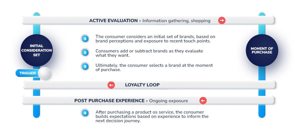
Apart from being non-linear and much more complicated, this model is different from the classic buying funnel in three significant ways.
After a ‘Catalyst’ has triggered the awareness, consumers start with an initial set of choices.
However, unlike the classic conversion funnel suggest, consumers start with fewer choices at the outset, and can expand their consideration set during the active evaluation stage. For marketers, it means that they need to invest in creating brand awareness, so that consumers may include them in the initial set.
It also means that not everything is lost for the brands that were excluded from the first stage. They can interrupt the decision-making process by entering the decision journey during the active evaluation phase and even bumping out a rival.
The second difference is that the outreach of consumers to marketers has become more important than marketers’ outreach to consumers. Customers now actively pull the information they want, as opposed to marketers pushing information to them. So, marketers must establish as many potential customer touch points as possible, by making information about their products available to consumers through every channel that their customers are likely to use.
Finally, the post-purchase behaviour has also changed radically. The increasingly competitive and complex world of today has given rise to two types of loyalty — active and passive.
Active loyalists (sometimes known as brand advocates) not only stick with a brand, but also recommend it to others.
Passive loyalists, on the other hand, keep on buying a brand merely out of laziness or confusion caused by the dizzying range of choices. Marketers still need to provide a great after-sales experience that inspires repeat buying. But they also need to take measures to expand the active loyalists and to ‘woo’ passive loyalists away from competitors.
The Conversion Journey
It is obvious that with these findings, the linear conversion optimisation model does not remain very practical.
The boundaries between the stages of the classic buying funnels have melted, and the cone has transformed into a continuous loop, during which customers actively seek information, evaluate alternatives, and make buying decisions.
They like to progress through the cycle on their own, without being prompted by marketers. So, the best that marketers can do is to assist the customers in finding information about their products and to make sure that the information is presented in a relevant, aesthetic, and interactive manner.
I have superimposed the web behaviour elements we identified above on the Consumer Journey Model of buying behaviour. Here’s the picture that emerges.
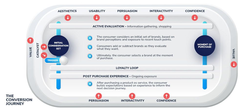
If this picture is making you dizzy, here’s what it means.
- Value is important throughout the consumer’s journey. You should be relevant, unique and specific in your message all the way.
- Catalyst is important to attract the customers to your offer, for the first time as well as for repeat purchases.
- Aesthetics are important for retaining the visitors on your website when they are in the active evaluation phase.
- Persuasion, interactivity, and confidence are important to ease the visitors through the evaluation process to the buying decision. They continue to be important during the post-purchase phase in order to keep your customers coming back.
Let’s quickly go over a hypothetical example to clarify things a bit more.
Let’s say you want your website to convert the maximum possible number of visitors into repeat customers.
You’ll start by working on the Catalyst. You’ll need to trigger recall about your product and make it enter your visitor’s consideration set. This would require not only off-page but also offline marketing and branding.
You could try and get a post published with a high domain authority blog, for instance, or place an ad in the local newspaper. In short, you’ll need to create brand awareness.
Now, let’s say your consumer is already aware of your brand and comes to your site to look for certain information.
Your site should have the right aesthetics and usability for the visitor to stick around.
They should know your company’s name and where exactly they have landed on your website.
The navigation and layout should be clear, and the copy should be persuasive.
The trust elements should all be there, and you’ll need to provide interactivity to engage the customer and help them get to what they want.
You can find out from your traffic sources the particular catalysts you need to create or improve. Your Analytics will tell you if your visitors are going away within a short time of landing on your page so that you can focus more on aesthetics and usability.
Heat mapping, mouse tracking and customer feedback tools will tell you more about what’s going on in your customer’s mind and where they are in the buying loop. Based on this info, you can improve different elements of their experience. So, if they’re leaving your page just when they were supposed to click the buy button, you’ll need to focus more on confidence or interactivity— maybe look at providing testimonials or a live chat service, if you don’t already.
Your Turn
As you might have noticed, the Conversion Journey Model is still in beta stage and needs a lot of refinement and real-life testing. I’ll share the results when we have put it through a substantial amount of testing. Until then, I would love to hear what you think about it and how you think it can be improved. The comments section is all yours!


