If you’re new to the ecommerce platform game, it may come as a surprise to hear that Shopify dominates much of the market.
Yes, Magento and WordPress (along with WooCommerce) have plenty to brag about, but Shopify has a unique niche. It has carved out a nice little spot that strays away from the open source crowd, moving away from what WordPress and Magento focus on.
Shopify is a paid platform, but it’s built for a commercial customer who may not know exactly how to build a website from scratch. This is particularly helpful if you’re new to online marketing, as ecommerce websites are far more complex to design and build than regular informational style sites. Selling online can be quite complex but with the right advice, you can make it work very well.
Shopify has all the tools needed for hosting, selling, processing payments and marketing through a number of different outlets. And that’s why so many big name companies have turned to Shopify to sell their products.
As a specialist ecommerce company, Shopify has great templates to choose from. Most companies want to get away from the default themes though and create something more unique. A lot of Shopify stores will get creative with their templates, or even design a site from scratch themselves. This makes it easier for the brand to stand out, while also ramping up the amount of functionality provided to customers.
With so many Shopify stores to choose from, picking the best ones is a tough task. Some of them do cool things with their search functions, while others just look awesome from the moment you land on the homepage. If you’re looking for an entry level solution to kickstart your online sales, we’ve picked our top five most creative Shopify stores online right now to show you what’s possible within the platform design-wise and serve as a slice of inspiration if you’re just getting started.
The Noun Project
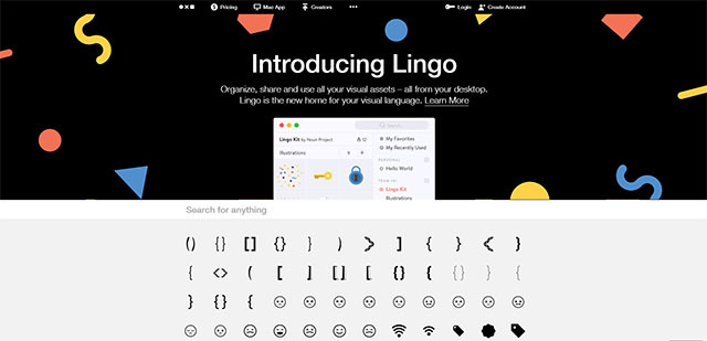
Talk about a great place to start. The Noun Project has a stunning homepage, even though we admit it’s not always easy to figure out exactly what it is they’re offering. Here’s the deal: The Noun Project sells icons for designers. If you need a bird icon for a business card, this website has you covered. If you’re a web designer and you’re in need of 100 different icons to scatter around client sites, this is a solid place to go. The most creative part of their own Shopify design is that they tell you to grab one of the icons below the search bar.
After you select an icon you like, the system automatically searches for similar icons, allowing you to see a number of varieties for comparison purposes. For example, if I dragged a mushroom icon to the search bar, the next page reveals dozens of collections with similar themes. We also enjoy that the majority of the website uses a black, white and grey palette, which corresponds nicely with the icon market. Most of the icons you see online are relatively simple from a color perspective, so this store reflects that trend well.
DoDo Case
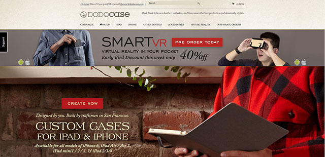
The DodoCase company online store has been through various website redesigns, but we really enjoy the most recent one. To start, they have their email address and live chat link at the very top of the site so customers don’t have to go searching for it. In addition, the large header offers beautiful imagery to show what the cases look like. Not only that, but they show models carrying around the cases, so you can see exactly how your new case might look on your arm or in your hand.
Once you land on the case building page, the site allows you to select your device and move on. After that, it has a full case builder with patterns, shades, colors, interior designs, elastics and monograms. If you run a company that plans on selling custom items, the Dodo brand is a great example of how you can make Shopify functionality really work for you.
JMandSons
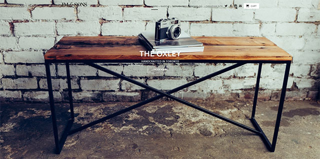
JM and Sons creates and sells custom tables, desks, lights, shelves and more. Why do we like the website? Because the homepage is so engaging and beautiful, it’s hard to turn away. The company realizes that they create rugged furniture, so it’s essential to share multiple photos and videos of what their products look like in the wild.
Throw a camera on top of the table to add to the hipster vibe and you’ve found yourself a niche. One of the takeaways from this site from an inspiration perspective is the importance of image selection and image sourcing. This site shows that you don’t need to learn how to code or be a web design whizz to create something beautiful. The Shopify layout here is actually quite simple but the use of eye-catching imagery takes it to another level.
Noon Copenhagen
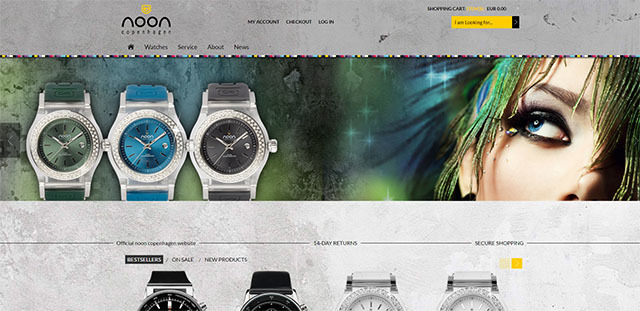
The Noon Copenhagen company makes stylish and affordable watches. If you go to the website, you’ll notice that every aspect of the website references the Noon branding in some way. The header lends a gritty, yet elegant vibe, while the white and black watch pictures coincide well with the grey backgrounds. Not to mention, the slider offers beautiful pictures of the watches and models, but it also has a slight slant to stand out from the rest of the crowd.
A lot of the style has to do with colors and textures, so it’s pretty clear that the marketing team knows what they’re doing at Copenhagen. If you’re looking to Noon to inspire your own fledging Shopify efforts, this one highlights how powerful the right color combination can be - it’s worth testing a few options to make your brand pop. The elements on page are fairly simply but the addition of the slider creates a focal point - this is easy to incorporate on Shopify.
PureFix Cycles
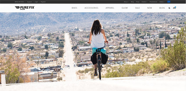
We recommend checking out the PureFixBicycles website to understand the way a proper product page should be setup. It’s not that this example is particularly creative, but it is a wonderful blueprint for how you should build your own product pages. When you click on a bike, you land directly on the product page.
However, the beauty of this page only fully emerges as you scroll down. This product page includes tons of pictures of people riding the bike, along with videos and commercials to see the thing in action. A sizing chart is offered, and various other modules give helpful information on how to choose your bike.
This landing page is filled with several stunning pictures of the bike, showing the value of investing in good photography and offering shoppers a range of images. It also demonstrates the importance of including space in your design for technical details.
Now that you’ve had a chance to see some of the more creative Shopify stores, ask yourself, is it possible for you to get this creative? Can you turn a beautiful Shopify theme into something that reflects your own brand? Thousands of companies do this on a daily basis, so you can too.


